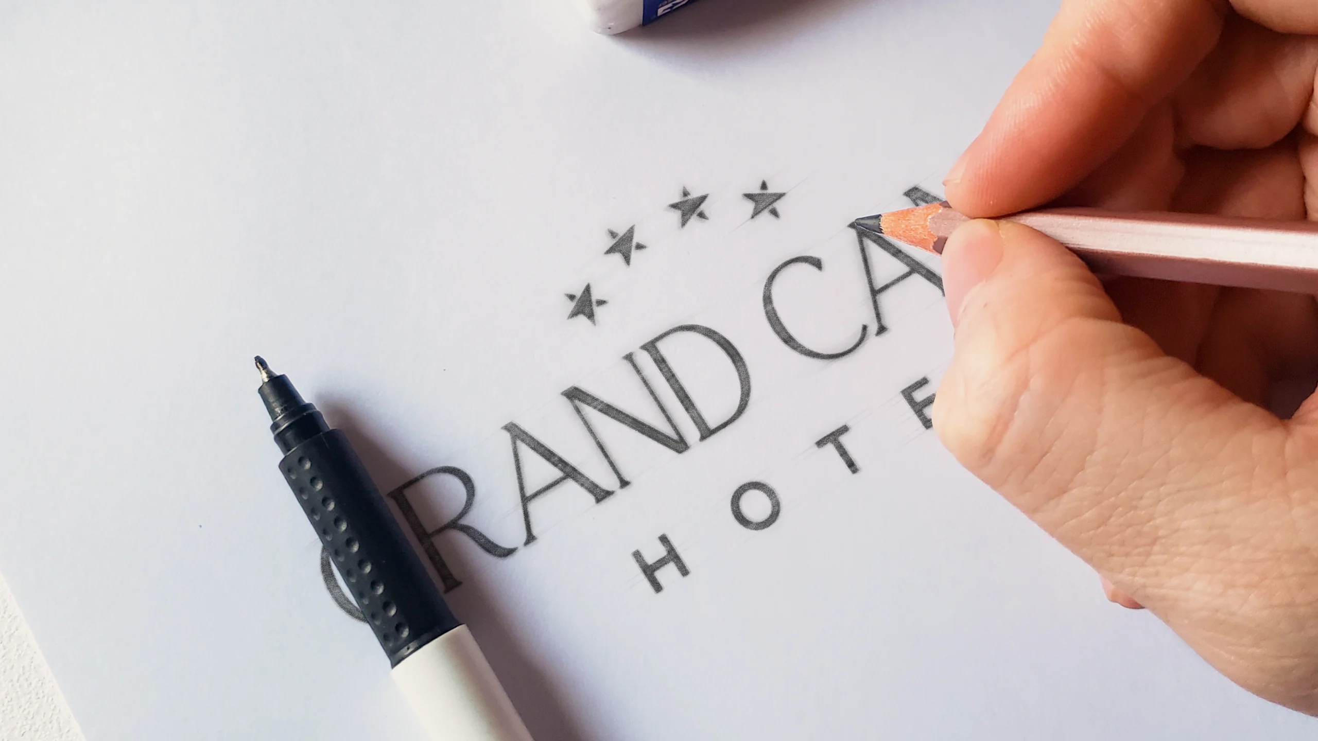
A sophisticated rebrand for one of Dublin’s premier hotels, blending contemporary minimalism with timeless prestige. The design reflects the hotel’s commitment to luxury and exclusivity, creating a brand that speaks directly to a mature, discerning audience.
The client required a brand identity that would convey refined luxury without feeling overdesigned.
The goal was to project sophistication and exclusivity for an adult-focused clientele, while ensuring versatility across signage, print, and digital applications. This meant balancing clean, minimalist lines with subtle details that add character and prestige.
Goal
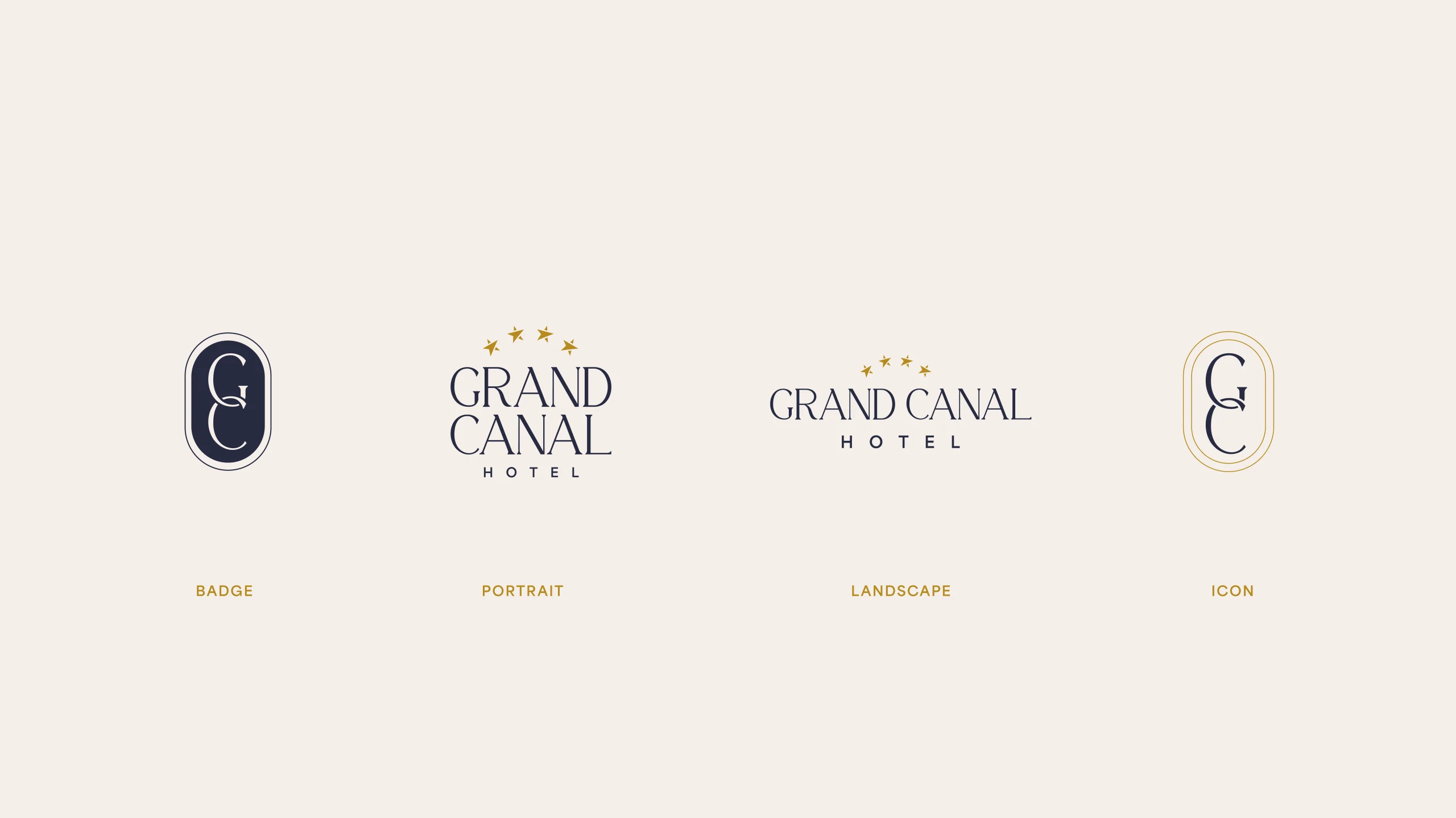
We crafted a sleek, contemporary logo suite featuring multiple lockups for flexibility:
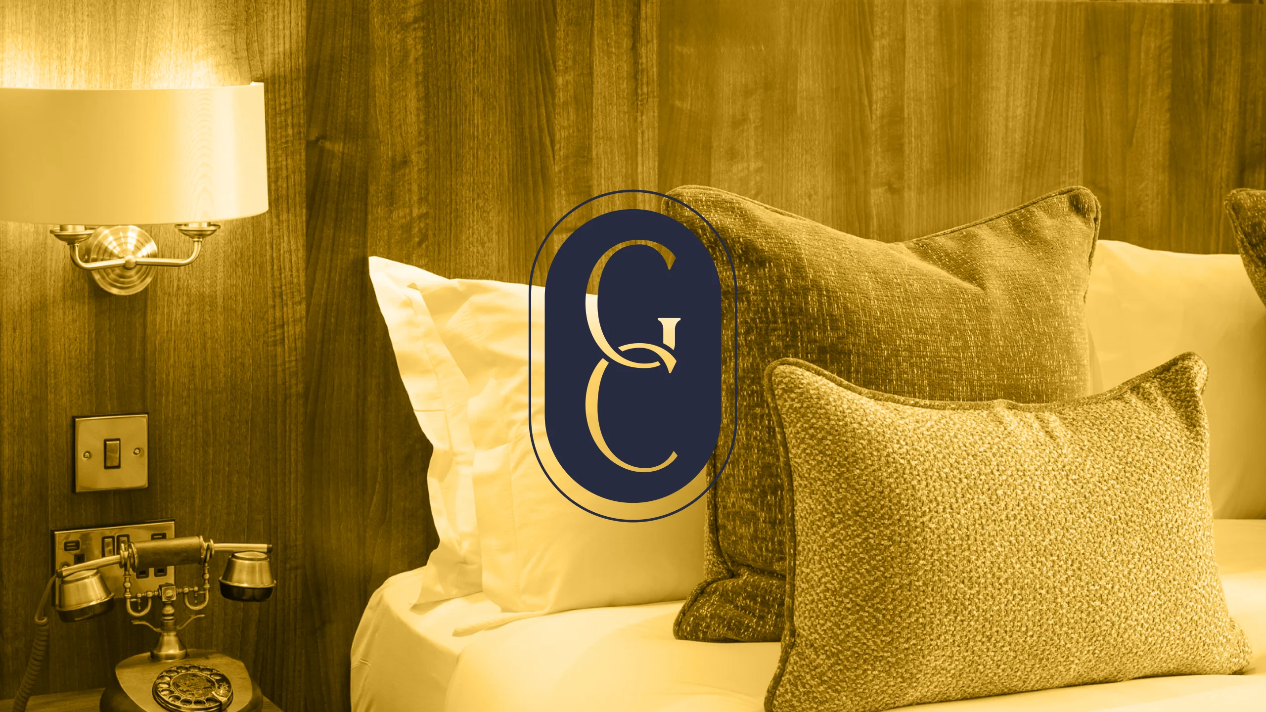
A portrait and landscape wordmark crowned with five gold stars, and an elegant GC monogram enclosed within an elongated oval badge. The monogram’s delicate serif forms suggest heritage and refinement, while the structured oval shape communicates stability and trust. The colour palette of deep navy, rich gold, and soft cream was chosen to express luxury, tranquillity, and timeless appeal.
Result
The rebrand positions Grand Canal Hotel as a destination for those seeking understated luxury in the heart of Dublin.
The versatile logo system works seamlessly across touchpoints, from the hotel’s façade to menus and digital platforms, reinforcing a consistent and premium brand experience.
An elegant rebrand that elevates the Hotel’s luxury image with a timeless, versatile identity.